UX WTF
Is your UX WTF-compliant?
I’m old enough to have been using the web basically since it was created, and I’ve been making web pages since the days of geocities. There’s lots of positive change in web user experience (UX). All that’s old is new again, and there is a puzzling prevalence of preventable rookie mistakes that cause one to ponder…

I’ve made all of these mistakes, but you don’t have to. Here’s my guidelines for de-WTF-ing your designs.
As a user of your website, I expect that…
There are no popups
Enough with the popups already. I don’t want to see a popup - not for your email list, not for a satisfaction survey, not to chat. I’m sure you read on a blog that email is key to conversions or some such BS - it’s more likely to drive me from your site. A popup gets in my way when I’m trying to do something. A small icon or sidebar item can be very helpful for those sort of things. I have never provided an email, engaged in chat, or filled out a survey in response to a popup.

Yes, a modal is a popup.
Enter submits a form
You know what’s great? Single page apps (SPAs). You know what sucks? People building SPA frameworks tend to forget how browsers work. I remember when forms were <forms>! HTML forms have some nice features - a submit button submits the form. The enter key also submits. Please retain these behaviors. People use keyboards, lots. Test your app with a keyboard.
I can type a date
A rich date-picker control is nice, but I should also be able to type in a date by hand, and in a format common in my locale (e.g. “m/d/yy” in the US).
I can enter numbers in any format

A credit card has 16 digits. Humans can’t keep a 16 digit string straight in their head. That is why it is broken up with spaces as four 4-digit numbers ON THE FRONT OF THE CREDIT CARD. I get stabby any time a form stops me from inserting spaces in a credit card field (similar issues for phone, etc.).
There are some really slick controls that reformat as you type. If nothing else, allow flexible input, then strip the non-numeric text on the backend before you process the number. One line of code (if that). Easy. Works for credit card, phone, currency, SSN, etc.
Similarly, you can add “http://” to a url. Thanks in advance.

Fields will give me the correct controls (mobile)
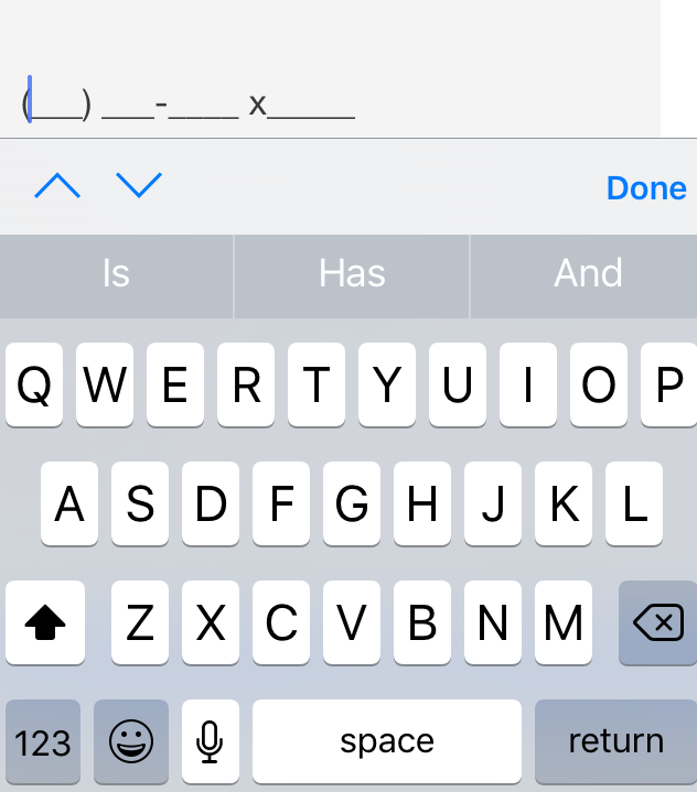
Test your mobile interface… using a real phone. Mobile interfaces suck for entering data. Make it as easy as possible. Mobile browsers tend to support input type attributes. This is the sort of meaningful semantic data that HTML is good for, and you should use. It also presents the user with the correct type of control (e.g. date selector, or streamlined numeric keypad).
See the html and UI for the below control designed for a phone number.
<input type="text" id="phone" name="phone" class="half" placeholder="Mobile Phone" data-bind="value: phone" maxlength="128">

Data is retained after validation
When I submit a form, it may have validation errors. Please retain all of the info I typed. This includes a complex form (address & credit card) or something simple like a login page. Retyping a username may not seem like a big deal, but you try continually re-typing an email address on a phone while I guess the password for your site that I haven’t used in 6 months.